Tuesday, July 16, 2013

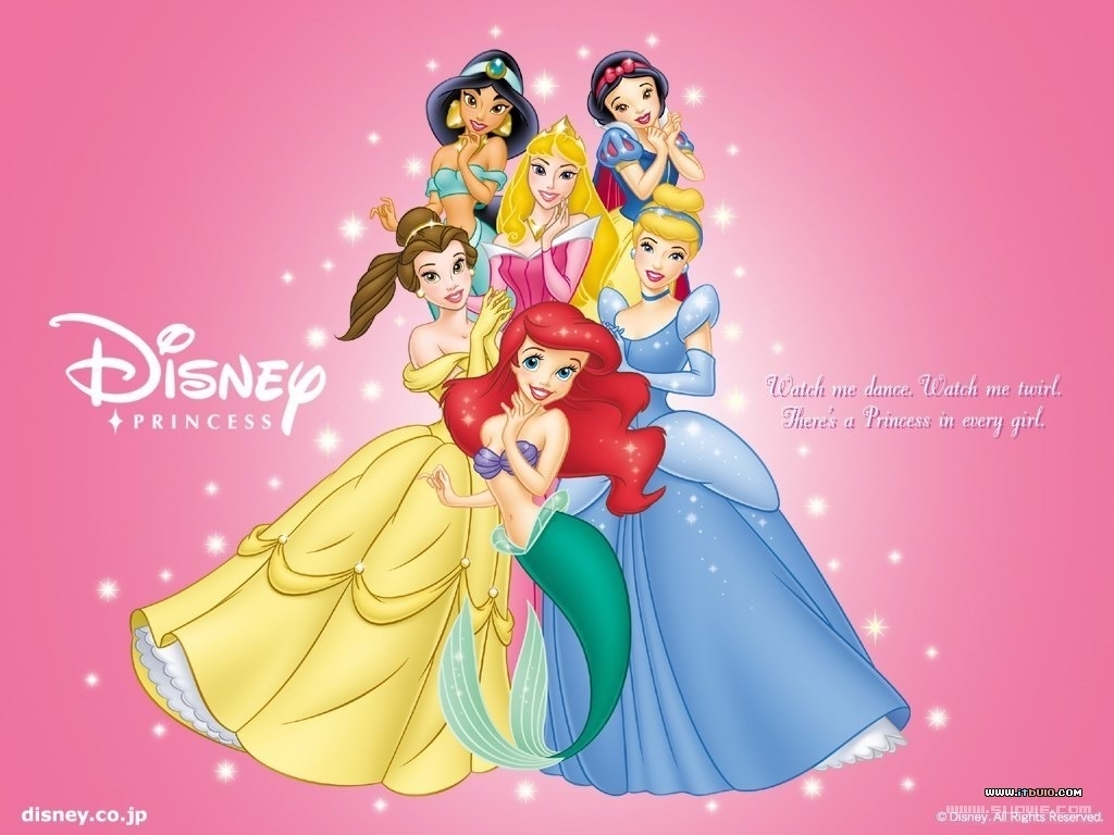
Disney Princesses: Heroes or Villains?


I grew up in the 1990s, which meant that something I looked forward to every summer was the new Disney movie. The Little Mermaid was my first "favorite" movie, and I still have the often-watched VHS tape my parents bought for me as a tyke. As I grew older I started looking at different perspectives on the "Disney Princess" brand, and how they are supposedly ruining today's generation of girls.

I will say right off the bat that today's toys are being marketed in a manner that is far too gender-specific. Also, the "Disney Princess" brand takes a lot of liberties with the characters. There was a lot of noise back when Merida joined the official lineup and was made to look more "cute and feisty" than, well, brave. Oh, and apparently Disney princesses are contractually obligated to wear clothing that is 50% glitter by volume.


But what about the actual movies? What kind of messages are they sending to girls? As it turns out, there are two sides to every princess. I'll give my quick summary of each movie, from a positive and negative perspective.

Cinderella
Positive: This movie has more female characters than male; the plot is driven by a memorable villainess and the heroine has a literal fairy godmother looking out for her. It easily passes the Bechdel Test (Cinderella talks to her stepmother and fairy godmother about going to the ball).
Negative: The heroine and title character does NOTHING to save herself from her situation. Literally nothing. The birds and mice make her first dress (without her knowledge); fairy godmother makes the second. Even at the end, when she's locked in her room, she doesn't try to escape. The mice have to save her again.

Sleeping Beauty
Positive: Like Cinderella, this movie has a mostly female cast. Maleficent stands out as one of the most memorable villains, male or female, from the Disney animated canon. Can any of the other villains turn into a FREAKIN' DRAGON? I didn't think so. Also, in the final battle, the fairies are the ones leading the charge. Prince Philip would not have gotten nearly as far as he did without their help. This movie passes the Bechdel Test, as the fairies talk about Aurora often. As does Maleficent.
Negative: Once again, our heroine is completely passive. The only thing she does on her own is sneak out into the woods, where she winds up in Love At First Sight (R) with her prince.

The Little Mermaid
Positive: Ariel is the first princess who decides to go after what she wants--and originally, it's not "a man." Even before she lays eyes on Eric, she expresses a desire to be human and be free of her father's rule. Also, we have another strong female villain.
Negative: This movie fails the Bechdel Test; Ariel and Ursula have a long conversation, but it revolves around becoming human so she can be with her prince. She also needs to undergo a dramatic physical transformation so she can be with him.

Beauty and the Beast
Positive: Belle is smart, brave, and caring. She is a favorite among nerd girls for preferring books and the eccentric company of her mad scientist father over the all-looks-no-personality Gaston. She is not afraid to stand up for herself, first to the beast, and then to Gaston.
Negative: Belle stays with a man whose behavior borders on abusive, at least in the beginning. She believes that she can change him, and it works. Girls, DO NOT TRY THIS AT HOME.

Aladdin
Positive: Jasmine knows what she wants, and is not afraid to tell anyone. She is determined to marry someone she chooses, rather than let her father force her into an arranged marriage. She escapes from the palace to experience life as a commoner--without magical intervention.
Negative: Name one other female character in the movie. There isn't one...unless you count the genie in drag. Jasmine has to stand up for women's rights, because she could very well be the only female in all of Agrabah.

Mulan
Positive: Mulan is driven by a desire to save her father and prove her own worth. She goes undercover as a soldier and ends up saving the whole country. She is a definite action hero. Also, she is the first Disney Princess to have a mother and grandmother who are still alive and present at the beginning and end.
Negative: They just had to throw a romance in, didn't they?

Brave
Positive: Merida does not wait around for anyone to solve her problems. She is not afraid to try different solutions when she dislikes her options. The central plot of the movie revolves not around Merida and a love interest, but her changing relationship with her mother. Both Merida and Elinor come out of the movie as stronger, and their relationship has reached a new level of understanding. She is also determined, like Jasmine, to avoid arranged marriage...and unlike every other princess on this list, is happily single at the end of it all.
Negative: They just had to make her a princess, didn't they? Also, Pixar has been making movies for almost 20 years now (yup, Toy Story came out in '94) and it took them until 2012 to make a movie with a female protagonist.

I skipped over some of the movies because I'm not really familiar with them (Tangled, Princess and the Frog, Hercules). I also excluded Pocahontas, because even though she's included in the "princess" canon, I'm not sure if she qualifies (her father is a chieftain, not a king). Mulan is technically not a princess either, but she appears more often than Pocahontas in official Disney Princess merchandise. If anyone wants to offer their analysis of the movies I missed, or a new perspective on one I've covered already, please do!

In conclusion: Watch the movies with your kids. Ask them what they thought the moral of the story was. Talk about the messages they picked up on, and how those lessons apply (or don't apply) to the real world. Media literacy is an important skill for kids to learn, and how they watch is arguably more important than what they watch.

Saturday, May 18, 2013

Movie Review: Star Trek Into Darkness


Star Trek Into Darkness opened this weekend! Hubby and I saw it last night. We had wildly differing opinions about Star Trek (2009). I loved it; he hated it. I went into this one excited, and he went along, by his own admission, for my sake and because he wanted to point out all the flaws afterwards. Into Darkness does have some flaws, even big ones, but we both agreed that it is overall a good movie. Well, Jason said it was "okay," but he also said it was "way better than the 2009 movie."

I'm going to begin my review with my spoiler-free observations, and then head into a discussion of the plot.

First off, this movie is shot much better than ST09. The lens flare is toned down quite a bit, where it is no longer the main camera effect. The camera shots themselves are also much more stable. It's good to know J.J. Abrams can keep the camera still for longer than half a second. I also like the continuing nods to the original series (though I'll discuss that more in the spoiler section). We got mention of the Gorn, Tribbles, and Harry Mudd, as well as Section 31 from Deep Space 9.

The acting was excellent. Jason pointed out Noel Clarke in an early scene, also known as Mickey Smith from Doctor Who (side note--season 7 finale this weekend!). Benedict Cumberbatch is excellent as John Harrison, the main villain. IMDB gives his character's real name, so go there if you want spoilers. Peter Weller as Admiral Marcus has some great scenes too. The main cast is just as good as they were in ST09. I especially enjoyed Chris Pine's performance. It was good to see Kirk get some actual character development. It was nice to see Nyota (Uhura) have some action scenes. Infinitely better than, say, dancing around in a skimpy costume to cause a distraction.

I'm looking at you, Star Trek V.

Oh, and this is a minor spoiler, but I was glad to see that someone at Starfleet finally decided the chairs on the bridge of the Federation flagship should include seat belts. Seriously, I know they have artificial gravity, but with all of the times we see people on the bridge getting knocked around, they needed seat belts badly.

Jason and I agreed that the opening scene was needlessly stupid. If a submarine can't go into space, why should a starship be able to go underwater? My other complaint about the movie was the way they handled things at the end, which will be discussed in the next section.

Overall, I'd give Star Trek Into Darkness 4 out of 5 stars.

HERE THERE BE SPOILERS

You have been warned.

I can understand why they decided to put Khan into the movie. He is the most iconic villain from the original movie continuity and, as Spock Prime points out, he was their biggest foe. They handled his character very well, both in terms of writing and acting. I can even buy that Kirk sacrifices himself to stop Khan and save the ship.

But did they really need to create the exact same circumstances from the end of Wrath of Khan? There were just way too many similarities. It went from feeling like a nod to the original movie to saying, "We couldn't think of anything original. Watch Wrath of Khan with Kirk dying instead."

And then they didn't even follow through with it! I'm still not sure whether I think this is good or bad. On the one hand, it undermines Kirk's sacrifice and shows that Abrams is still playing it safe. Plus, it would be very interesting to see how everyone goes on without Kirk. On the other hand, I didn't actually want to see him dead. Spock's death in Wrath of Khan is ultimately undone as well, so maybe they're combining the endings of II and III? I suppose what I would have wanted was for someone (probably Spock, to tie in with the opening) to save Kirk after he has shown he is willing to sacrifice himself. I would also have created an entirely different circumstance for Kirk to put himself in.

I am very intrigued by the idea of the militarized, possibly evil Starfleet. Admiral Marcus was such an evil slimeball that I almost wasn't sorry when Khan snapped his neck. I felt bad for Carol, though. Good to know she's made of tough stuff. I suppose the next movie will have to feature this "inevitable war" with the Klingons. Maybe they'll bring the Romulans in, too. I would love to see the Federation and the Romulans team up; ever since I read Diane Duane's Rihannsu series I thought it would be great to see some ties established. Maybe they can even bring in Ael. Wishful thinking, I know. I would love to know what Diane Duane thinks of the new movies.

Here is another unlikely prediction: the Borg. They have shown up in every series but TOS; they even appeared in the prequel series, although they were never named as such in order to preserve continuity.

Wednesday, May 15, 2013

Book Review: Dianne Duvall's Immortal Guardians series

I have been a fan of the vampire genre since I was in high school. It started out with Angel (and, shortly thereafter, reruns of Buffy) and quickly spread to encompass a wide array of books, movies and TV shows featuring the undead. Basically, if it's got fangs, I will read it. Or watch it. I may not like it, but I will give it a shot.

Dianne Duvall's Immortal Guardians series has three books so far, plus a novella included in a collection called Predatory. The fourth book comes out later this year. I picked up the first book on a whim and was immediately struck by the complex world created in this story. There are normal humans, obviously. There are also "gifted ones," or humans with supernatural abilities and "advanced" DNA. But vampirism is completely unrelated to the abilities of the "gifted ones." In fact, it comes from a virus that turns a human into a vampire and turns a "gifted one" into an immortal. The thing about the vampires is that they tend to go crazy after a few years. Crazy as in "homicidal." So the job of the immortals is to hunt down the vampires and stop them from killing people. The immortals, due to their already differing genetics, are protected from the insanity that eventually kills any human-turned-vampire.

Then we have Ami and Zach, who are...none of the above. We don't find out Ami's secret until halfway through book 2, and still don't have an explanation for Zach. Though to be fair, Zach has only shown up in a few scenes, and we don't even learn his name until the third book. Usually a world that starts out with vampires will add other supernatural elements, such as werewolves, demons, and magic. Duvall takes the scientific approach instead, which I find pretty cool. 

So we have complex characters. We also have tons of action. There is no shortage of fighting, death, and bloodshed. We get descriptions of all of the characters' weapons. The male main characters are all Immortal Guardians, so they have centuries of experience with fighting and killing vampires. But the women are no slackers, either. Sarah (from book 1) is a college professor who is thrown into the world of immortals and vampires by accident and is more than capable of holding her own. Ami (from book 2) kicks some serious vampire ass, despite being tiny and seemingly vulnerable. Think River Tam with Merida's red hair. And Dr. Melanie Lipton (from book 3) is smart and fearless. She knows what she wants and isn't afraid to stand up for the vampires she's trying to save. Makes me wonder if Duvall is a fan of Buffy herself.

There is just so much I love about this series. The characters are well-rounded, and Duvall does a great job of dropping subtle world-building hints and raising questions that are left unanswered at the end of each book. At the same time, the main story itself in each book is resolved so that each novel stands on its own. And I'm not gonna lie, the steamy scenes are pretty good.

Oh, did I mention these are paranormal romance novels?

Nine times out of ten, you would not find me defending bodice rippers. Usually the plot is thin, the women need saving, and any "foreshadowing" is just setting up two minor characters for their own love story. If you remove the relationship between Alice and Bob, most romance novels fall apart completely. I've read a few Harlequins in the past, and they were all pretty forgettable. The Immortal Guardians books are the first romance novels I've read (primarily) for the plot, and actually cared about the overall story. 

Make no mistake, the Immortal Guardians books are romance novels, complete with naked torsos on the cover. If you removed all traces of romantic relationships, admittedly, the series would be a lot thinner. Still, that's true of nearly any series. If you have enough characters, eventually some of them are going to get together (in fanfiction if nowhere else). But you could remove all of the sex scenes and still have an exciting, compelling story in a complex world. Which makes me wonder why they were written and marketed as romance novels in the first place.

The one quibble I have with the series is a minor one: all of the immortals are literal vegetarian vampires. They need blood, but they also eat normal food, and they are all health food nuts. We get loving descriptions of vegetarian meals, prepared with organic ingredients. But it never rises to true Author Tract levels and the story is still definitely enjoyable even if you don't happen to share her passion for salads.

Overall, I would give the series 4.5 out of 5 stars. If you like action, supernatural creatures, and a dash of hot romance, definitely check it out.

Monday, April 29, 2013

C2E2 2013!

Convention season has begun! The Chicago Comics and Entertainment Expo, more commonly known as C2E2, was this weekend at McCormick Place. Jason went all three days; I was unable to get Friday off, so I went on Saturday and Sunday.

There was a lot more room devoted to the convention this year than in previous years, which made everything seem less crowded. I noticed a huge difference on Saturday--even with all of the crowds, I was still able to navigate pretty easily.

My brother and I went to a panel on Saturday. One of our favorite YouTubers debuted two new videos. If you are a fan of comic book movies, you should definitely check out ItsJustSomeRandomGuy. He makes videos with action figures, and they are HILARIOUS. He started out doing parodies of the Mac/PC ads, but he also does movie trailer parodies, song parodies, and a series of original stories with its own continuity (boom). The main event at the panel was the final episode in his "Zero Hour" series, which ended up being a rough cut without special effects. It's not online yet. RandomGuy opened the panel with this song parody, and he sang Superman's part live.


The "panel" was actually on a stage near the concessions, rather than in a room with rows of chairs. Johnny and I sat at a table with a bunch of strangers and started talking about our various interests as we were waiting. One of the things I love about conventions is how easy it is to find things in common with people.

I did all of my shopping on Saturday. I bought two t-shirts (Pinky and the Brain and Care Bears), some buttons for my convention backpack, and a "Live Long and Prosper" necklace. My favorite find was a booth selling vintage Care Bears (yes, I'm kind of Care Bear crazy). They were 20 bucks each, so I only bought one.

Sunday's highlight was meeting Felicia Day! She signed my "Doctor Horrible" DVD, and she was super nice.


I saw some great costumes both days. 


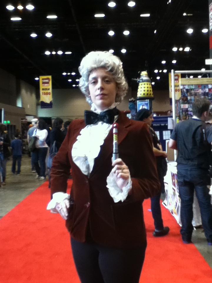
Jason spotted this female Third Doctor on Friday, and then we ran into her again on Sunday right as we were leaving.

Doctor Horrible was popular this year:


I saw a lot of families with kids on Sunday. It seemed to be the best day to bring them, because the crowds were smaller. I had never been to a convention on Sunday before. It was interesting to compare the crowd levels. 

Anyway, this girl had a great costume:


Whatever you do, DON'T BLINK.

And finally, someone at the convention on Saturday had the best car EVER.


It's a Volkswagen Ladybug! How cool is that?

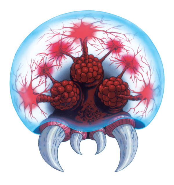
That's it for my convention wrap-up. Hat-a-week should be returning shortly. I am close to finishing my sweater, and I already have my next hat commission. Jason has requested a Metroid hat, which my brother heartily seconded. For those of you unfamiliar with the monsters, this is a Metroid: 

I'm not entirely sure how well this will translate to hat form, but we shall see!

Saturday, March 23, 2013

Business Idea!

Even though we had the first day of spring a few days ago, and it still feels like winter, I must be ready for summer. I had a very pleasant dream last night about going to the beach.

When I woke up, I started thinking about swimsuits. I don't think I need to buy any, because the ones I bought last summer should still fit, but they're fun to buy (or even just look at). My idea last year was to buy separates so I could mix-and-match. I have two tops with different designs and two bottoms that match either top, so it's really like I have four swimsuits. I could even buy another top that matches either bottom and get two suits for the price of one item!

But there doesn't seem to be any line of swimsuits really designed around this mix-and-match idea. So this morning I came up with this brilliant business plan, which is sadly far beyond my abilities to do myself. If anyone reading this wants to steal my idea, please do. You don't have to credit me or anything (maybe offer some stock options so I can cash in when your company makes a billion dollars).

So this company would make swimsuits designed to be mixed and matched. The tops would all be patterned and the bottoms would all be solid, just for simplicity's sake. You could start out with three colors (say black, white, and red) for the bottom. The tops could have any kind of pattern that uses those colors. Stripes, polka dots, flowers, checks...anything, really.

But what would make this different from the other suits on the market is that all of the bottoms would have belt loops, and all of the tops would come with a strip of matching fabric to wear as a belt. This would tie everything together and make it look like that set was designed to be worn together. But then you can change the top and change the belt, and have another perfectly matched suit. It even encourages people to buy everything from your company (instead of also mixing and matching whatever's cheapest).

If you wanted to take the customizing idea even further, you could have the bottoms come with a solid color bow or something to attach to the top. That way you could have designs with only two of the colors, like zebra stripes, that can still be worn with any bottom.

The company could have as many or as few options as you like. In addition to fabrics, you could offer different styles for the tops and the bottoms. Or just keep it simple. I would do this myself, but unfortunately I don't have the sewing skills to even attempt making my own suit. So somebody make this business happen.

Any top + Any bottom = Swimsuit. Who's with me, ladies? I would buy one of everything.

Thursday, March 7, 2013

Hat #8 (Hat-a-week): Jayne Hat

Man walks down the street in this hat, you know he's not afraid of anything...


This hat is a great way to find other fans of Joss Whedon's Firefly. Fellow browncoats will immediately recognize this as the hat that big, tough guy Jayne Cobb proudly wears after receiving it in a package from his mother.

When I was sorting through my stash of yarn, I set aside the red, yellow, and orange, which was left over from the Jayne hat I made a few years ago. All three colors are Lion Brand Vanna's Choice, so the yarn can be found at any craft store. I used my standard hat pattern for the orange and yellow sections, with an inch of ribbing at the bottom. It should be noted that hats with earflaps usually don't have ribbing--the part that makes the hat stretchy--but it's visible on the original so I included it here. I used the orange until it was about 4 inches and then switched to yellow. When I finished off the main hat, the next step was the earflaps. For the first one, I turned the hat upside-down and picked up 20 stitches. I worked back and forth in stockinette stitch until they were about 3.5 inches. I decreased by knitting 2 stitches together across the right-side row twice (leaving me with 10 stitches, and then 5). On the next right-side row, I decreased 2 more stitches and cast off the final 3. Then I repeated on the other side.

The final step was the giant pom-pom on top. I have a set of pom-pom makers, in 3 different sizes, so naturally I grabbed the biggest one. I used all three yarns together, and when I was done I used the yarn end from the top of the hat to sew it in place.


Pretty cunning, don'tcha think?

My current knitting project is actually not a hat--it's this sweater from a book called Vampire Knits

Photo from Ravelry
Mine is going to be denim blue. I'm working on the lace portion at the bottom now. I will be taking a break from Hat-a-week while I finish the sweater, because I really only have time right now to work on one knitting project at a time. I'll try to post some progress shots on the sweater, though!

Saturday, February 16, 2013

My iPod is bigger on the inside

A couple weeks ago I decorated an iPod case for my brother as a birthday present, and mentioned that I had an idea for another custom case. I had some time off this week and was finally able to get it done. Introducing...the TARDIS iPod!


Sorry for the flash..I'm used to using the iPod camera to take pictures for the blog, but I had to dig out my old digital camera to get a picture of the pod inside the case. Here's the best part:


Matching background screen!

And a shot of the back (before I assembled the case):


Here's how I did it. The first step was drawing the outlines and the words. I printed out a picture of the TARDIS the same size as the case and taped the case right on top. Actually, it was the same width but taller. That's why the bottom panels cut off in the middle. I also flipped the picture to create a mirror image before I printed it out, because I did all the painting on the inside of the case. This keeps it from rubbing off after use. I used the same paint markers that I had for Johnny's case: black for the outlines and a thin white marker for the words.


On the front, I lined it up so the hole in the center covers up "Public Call" and the on the side covers up the "O" in BOX. On the back, I lined it up so the hole for the camera covers up the first 3 letters. Now it says "ICE BOX" which I find amusing. Rather than try to trace over the letters in "Public Call" I just made small lines. The white you see in the windows and on the sign is actually on the picture I taped the case onto. A more confident artist could probably freehand the whole thing, but I like tracing. The markers are very easy to use and the lines are nice and even.

In my first attempt on the front, I colored over the words with the black marker. Either the words needed another coat or the paint wasn't fully dry, because the words were barely legible afterwards. I had to muddle over the problem for a bit until a solution came to me: if the paint markers are acrylic, and nail polish is also acrylic, will nail polish remover work to take off the paint? Answer: yes, it will. Rather than risk smearing the paint a second time, I drew lines above and below the words and left the space around them blank.

To make the sign, I cut out the sign from the picture I had printed (not mirror-image, so I had to re-print it) and pasted it in. I used a mixture of Elmer's glue and water. The only problem is that the printer ink is water-soluble, so the edges of the sign are now illegible. I was kind of going for a stained-glass feel, so it kind of works. That particular bit just looks more aged than the rest.

To fill in the background, I used tissue paper. I could have used solid blue, but all I had was plain white. However, I also have a set of 50 colored pencils! I colored in a block of blue using a few different shades mixed together. First I cut out small squares of white to fill in the windows, and a thin strip of black for the top:


I ended up doing three layers of white squares. The background covers the entire case, so there's blue behind the white. I didn't bother cutting around the windows; three layers gives enough opacity that you can't tell that there's anything behind it. Likewise, two layers of blue was enough to create the effect I wanted. 


For the front, I did thin strips to cover each side, again with a layer of black over the words before the two layers of blue.


I let everything dry overnight, then went back and trimmed away the extra paper with an X-acto knife. Don't try any trimming while the glue is wet--the paper is so thin it will almost certainly tear. I even had a couple rips while I was applying the paper, although that can easily be repaired by gluing a small piece on top to cover the hole. After the trimming was done, I put another glue-and-water coat around the edges and corners so they wouldn't pull away.


The first time I tried putting the two halves together, the bottom corners wouldn't fit, so I had to go back and trim a liiiiitle bit more paper from each side. The only problem with this particular case is that the tabs lock so securely I'm always afraid something is going to snap when I take them apart again. Now that everything is done it's going to stay together for a long while.

The finishing touch was my background picture. I traced over the windows and door panels onto another piece of tissue paper, colored it in, and scanned it into my computer. From there, I played around with it a bit in MS Paint (yes, I'm old-school like that) to darken the colors and add in the "Pull to open" sign. Then I transferred it to my iPod and set it as the background screen!